
Have you ever walked into a room and immediately felt relaxed? Or stepped into somewhere really bright and colourful and suddenly felt more awake?
Colour can do that.
We probably don’t think about it very much because we’re surrounded by colour all the time, but it can have a surprisingly big effect on how a space, piece of artwork or design makes us feel.
That’s why interior designers, artists and brands spend so much time thinking about colour. It’s not simply about choosing colours that look nice together. The colours you use can completely change the mood you’re trying to create.
Think about a crisp white room compared with one filled with warm creams, browns and terracotta shades. The white might feel fresh, clean and open, while the warmer room can feel much cosier and more inviting.
And then there are colours such as deep emerald green, sapphire blue and rich burgundy. These stronger, jewel-like shades can add drama and make a space feel much more luxurious. On the other hand, soft blues and greens can create a calmer, more peaceful feeling.
There is quite a lot going on behind the scenes with colour, too. Hue, saturation and value all affect the way we see a colour. Change just one of those things and you can end up with a completely different result.
But here’s the thing: colour psychology isn’t a set of rules that you have to follow.
It’s tempting to read that blue means calm, yellow means happiness and red means energy and think that’s the whole story. It really isn’t.
Our response to colour can be incredibly personal.
Culture can influence the way we interpret colours, and our own experiences matter too. Maybe a particular shade of blue reminds you of the sea and makes you feel relaxed. Someone else might associate that same blue with something completely different.
So, rather than treating colour psychology as a rulebook, I think it’s much more useful to see it as a starting point.
It can give you somewhere to begin, but don’t be afraid to trust your own instincts.
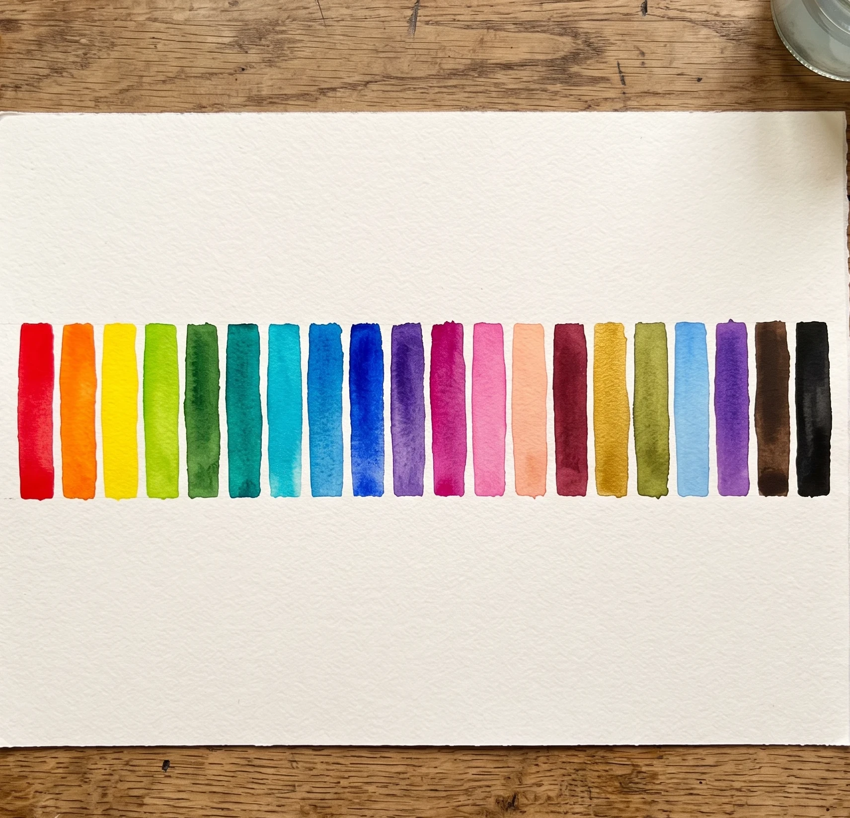
Start With the Feeling You Want
Before getting carried away choosing pretty colours, think about what you actually want the space or design to feel like.
Are you creating a quiet little corner where someone can curl up with a book? A bright kitchen where everyone gathers? A creative workspace that needs to feel energetic? Or perhaps you’re designing something for a website and want it to feel friendly and approachable?
The purpose of the space or design matters.
Once you know the feeling you’re aiming for, choose one colour that captures that mood. Think of it as your starting point.
From there, you can build the rest of your palette around it.
You might have one dominant colour, a couple of supporting shades and then one or two accent colours to add a bit of interest. You really don’t need twenty different colours to make a design interesting. Sometimes a small, carefully chosen palette works much better.
For a cosy, relaxing space, you might combine soft blues with warm browns and earthy neutrals. For something more lively, you could bring in brighter yellows, fresh greens or warmer shades.
There’s no magic formula here. The important thing is that the colours work together and create the feeling you’re after.
Don’t Trust Your Screen Too Much
This is one I think is really easy to forget.
A colour can look absolutely perfect on your computer screen and then look completely different when you see it in real life.
Lighting makes a huge difference.
Natural daylight can make colours look one way in the morning and completely different later in the day. Artificial lighting can change them again. And then you’ve got everything around the colour to consider as well. Walls, furniture, flooring and other materials can all affect how a colour appears.
So, if you’re choosing paint or other physical materials, get some proper samples.
And don’t just look at them once and make your decision.
Put them somewhere you’re actually going to see them and look at them at different times of the day. Morning, afternoon and evening can give you three surprisingly different versions of the same colour.
The same applies to digital artwork and design. Colours can look different on different screens, so it’s worth checking how your palette actually looks in the finished design rather than relying entirely on what you see while you’re creating it.
Think About Accessibility Too
There’s another side to colour that’s worth thinking about, particularly when you’re designing something other people are going to use.
Colour isn’t just there to make something look good. It can also help people read, understand and navigate a design.
For example, if you’re designing a website, there needs to be enough contrast between the text and its background. Pale grey text on a white background might look stylish, but it isn’t particularly helpful if people struggle to read it.
It’s also important to remember that not everyone sees colour in exactly the same way.
If you’re using colour to communicate information, don’t make colour the only way of communicating it. Labels, icons, patterns, textures or other visual clues can all help.
Have a Bit of Fun With It
I think the biggest mistake you can make with colour is worrying too much about getting it “right”.
Yes, there are theories about colour. Yes, there are colour wheels, complementary colours, analogous palettes and all sorts of useful guidelines.
But they’re there to help you, not to tell you what you’re allowed to do.
Sometimes you’ll put together a colour combination that looks completely wrong according to the rules — and somehow it works.
That’s the fun of experimenting.
Start with the feeling you want to create, choose a colour that captures it, and then play around with different combinations. Try something unexpected. Change the saturation. Make one colour much darker or lighter. Add a little accent colour and see what happens.
And most importantly, step back and look at the whole thing.
Does it feel the way you wanted it to?
If it does, you’re probably onto something.
Colour theory can give you a really useful starting point, but your own eye and your own creativity are just as important.