
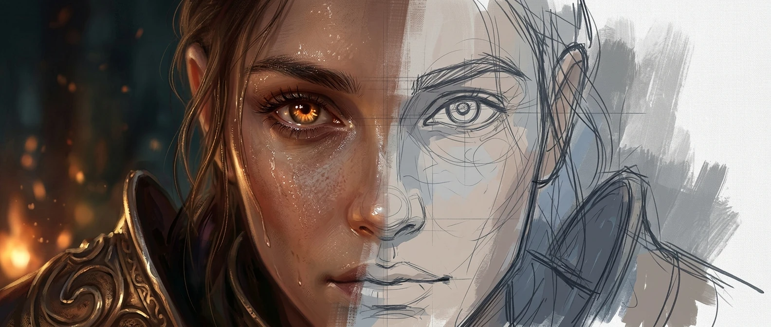
Most pieces fall apart the same way. A painter opens a new canvas, sketches something loose and promising, and then moves straight into rendering one corner of it in full detail before the rest of the image has a value structure, a light direction, or a color scheme. Three hours later the detailed corner looks great and the rest of the canvas looks like a different painting trying to catch up. The fix is not more skill. It is a different order of operations.
Professional illustrators do not paint a piece from start to finish in one continuous pass. They move through distinct stages, each with its own goal, and they do not let themselves render detail until the stage before it is settled. This matters more for intermediate painters than almost anything else they could practice, because the skills are usually already there. What is missing is the production structure that turns a loose personal habit into a repeatable professional digital painting workflow.
Why Working in Stages Beats Painting in One Go
Painting in stages exists for one reason: it is far cheaper to fix a mistake early than late. A bad value structure is a ten minute fix at the thumbnail stage. The same bad value structure, discovered after twenty hours of rendering, means repainting large sections of finished work.
Each stage in a professional workflow answers one question and locks it down before the next stage asks a new one. Thumbnails answer “does this composition work.” The sketch answers “is this the right drawing.” Color blocking answers “where is the light coming from and what is the palette.” Rendering answers “what does this surface look like up close.” Each stage builds on a decision that the previous stage already settled, instead of trying to settle everything at once.
This also changes how a piece gets reviewed, whether the reviewer is a client, an art director, or just the painter’s own judgment the next morning. A rough sketch is easy to redirect. A half rendered painting is not; by that point, everyone involved, including the artist, is reluctant to touch what already looks finished, even when it isn’t working.
Stage One: Thumbnails and Value Roughs Before You Touch Detail
A thumbnail is small on purpose. Working at a tiny canvas size, often no larger than a couple of inches on screen, forces decisions about composition and value without any temptation to render. At that size, detail is literally not possible, so the only thing a thumbnail can communicate is the large shapes, the balance of light and dark, and where the eye goes first.
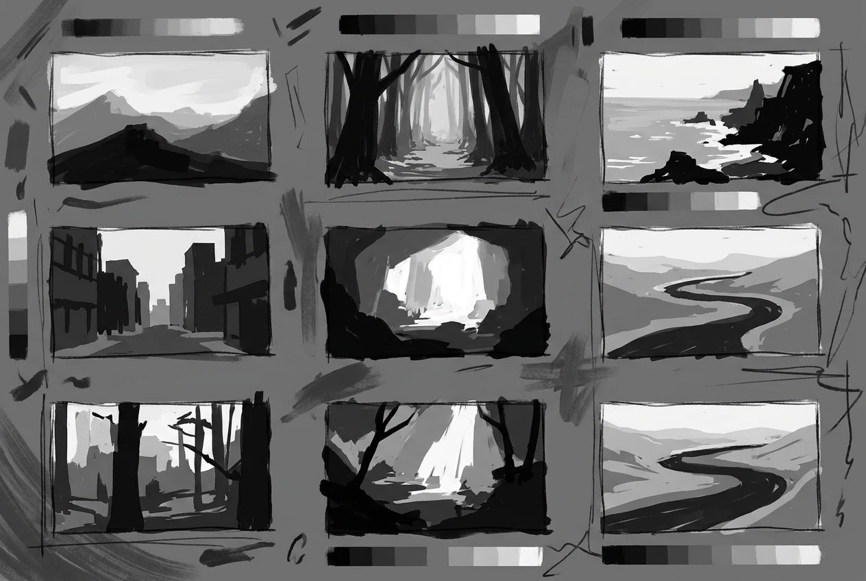
A useful thumbnail stage produces several options, not one. Three to six small value studies, each testing a different arrangement of light source, focal point, or shape language, cost very little time and save enormous amounts of it later. Comparing them side by side shows which composition actually reads clearly at a glance, which is the test a finished piece has to pass anyway.
The temptation at this stage is to render, because a loose thumbnail feels unfinished and uncertain. Resist it. The value of a thumbnail comes from its looseness: it shows the skeleton of the image before the skin goes on.
Stage Two: Locking the Sketch and Getting Approval Before Rendering
Once a thumbnail is chosen, it gets scaled up and redrawn as a full sketch, not stretched or traced but rebuilt at working resolution with proper proportions, anatomy, and perspective. This is the stage where line work, gesture, and structural accuracy matter. It is also the last stage where major changes are nearly free.
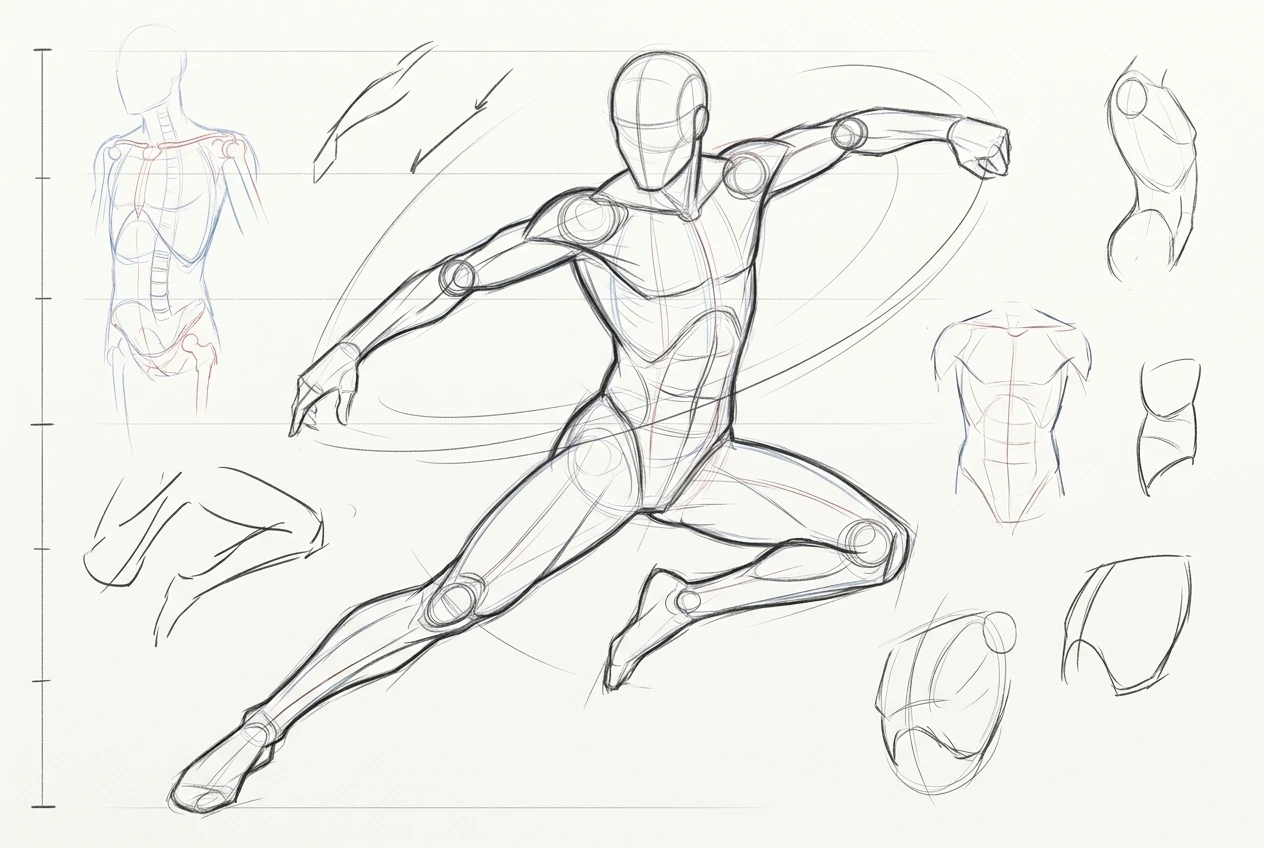
For client work, this is the point to get sign off. Sending a client a clean line sketch and asking for approval before moving into color and rendering prevents the much more painful conversation that happens when a client wants changes to a piece that is eighty percent rendered. For personal or portfolio work, the equivalent move is to step away from the sketch for a few hours, come back, and look at it with fresh eyes before committing to it.
A sketch is locked when the pose, the proportions, the composition, and the major shapes are all something the painter is willing to commit the next several stages to. Locking the sketch does not mean it is perfect. It means the problems left in it are problems that rendering will not fix, so they need to be solved now.
Stage Three: Blocking In Flat Color and Establishing Light Direction
With the sketch locked, the next stage is flat color blocking: filling in local colors as solid, simple shapes on separate layers, with no gradients, no texture, and no rendering. This stage exists to answer two questions at once: what is the palette, and where is the light coming from.

Light direction gets established here with broad shadow shapes, usually on a multiply or similar layer over the flats, blocked in as simple masses rather than carefully rendered forms. The goal is to know, before any detail work starts, which surfaces face the light source and which fall into shadow. Painters who skip this step often find themselves rendering a surface in careful detail only to realize afterward that the shadow shape sitting on top of it is wrong, which means the detail work has to be redone.
This is also the stage to settle the color scheme as a whole, since flat shapes make it easy to select each color and adjust hue, saturation, or value across the whole piece without disturbing any brushwork. A reader who wants a deeper look at how color choices set mood and atmosphere before rendering begins will find that covered in exploring color palettes for mood and atmosphere.
Stage Four: Rendering Form, Depth, and Surface Detail
Only now, with composition, drawing, color, and light direction all settled, does rendering begin. Rendering is the process of turning flat shapes into believable form: adding gradients that follow the form of each object, pushing contrast at the focal point, and softening edges that should recede.
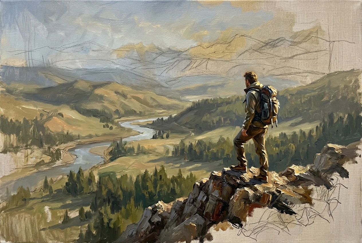
A professional approach to rendering generally moves from large to small and from background to foreground. The background gets established first, at a lower level of finish, before attention moves to the midground and finally the focal point, which receives the most detail, the sharpest edges, and the highest contrast. This keeps the eye moving to the right place in the finished piece instead of getting pulled toward secondary areas that happen to be heavily rendered.
Surface detail, texture, and material rendering belong at the end of this stage, applied only after the underlying form is already reading correctly in grayscale or at a squint. Texture painted onto a form that is not yet structurally sound just makes the structural problem harder to see and harder to fix. For specific approaches to rendering convincing surfaces once the form is ready for them, see creating textured surfaces with digital brushes.
Stage Five: Finishing Passes, Color Grading, and File Export
The finishing stage is where a painting stops being a collection of correctly rendered parts and starts reading as one unified image. This usually involves flattening or merging layers into a working composite, then applying overall adjustments: a color grade across the whole piece, adjustments to overall contrast, and small corrective edits to edges or shapes that still look off now that everything is visible together.
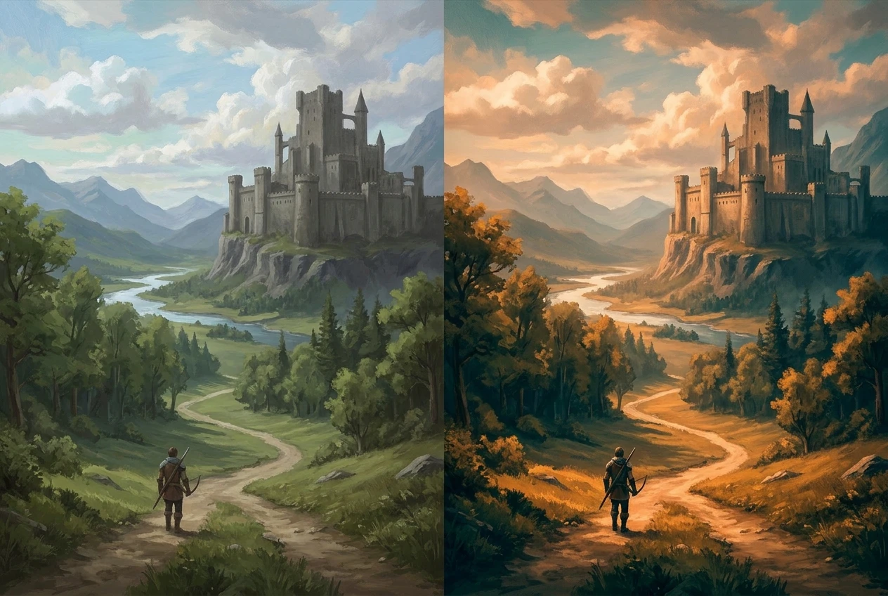
A color grading pass, often done with an adjustment layer in a blend mode like overlay or soft light, ties the whole palette together in a way that individual layer adjustments earlier in the process cannot. It is also the point to check the piece at a distance or at reduced size, since many issues that are invisible up close become obvious when the image is viewed the way most people will actually see it: small, on a screen, among other images.
Export is a production step like any other, which means it also benefits from a repeatable approach. A professional workflow typically produces more than one file: a large flattened file for print or portfolio display, a web sized version for online posting, and sometimes a layered working file kept for archive or future revision. Settling on consistent export settings, resolution, and color profile ahead of time removes one more decision that otherwise gets made inconsistently, piece to piece.
Building a Workflow Checklist You Can Reuse on Every Piece
The value of all five stages comes from repeating them the same way every time, which is easiest to do with an actual written checklist rather than a mental one. A simple version might look like this:
-
Thumbnail stage: produce three to six small value studies, choose one
-
Sketch stage: redraw at working resolution, lock proportions and composition, get approval if working with a client
-
Color block stage: flat local colors, broad shadow shapes, confirm light direction and palette
-
Render stage: background to foreground, large to small, focal point receives the most contrast and detail
-
Finish stage: flatten, color grade, check at reduced size, export in the sizes and formats needed
Keeping this checklist next to the canvas, and actually checking items off, does more for consistency than any single technique. It also makes it much easier to diagnose a piece that isn’t working: instead of guessing, the painter can go back through the stages and find exactly which one was skipped or rushed.
Once a piece has been through this full workflow, it is ready for your portfolio. See creating digital art portfolios for how to present finished work like this to clients and employers.