
How to Light a Painting with Color: Temperature, Shadow Hue, and Story.
A painting can have well-chosen hues, clean edges, and accurate drawing and still look like a coloring-book page. The usual cause is that every object got its own color, and no single light is shining on any of them. Color theory for digital painting lighting comes down to deciding what the light is, then letting that decision change every color in the picture.
This article takes one workflow and applies it to a single canvas. You block in a flat palette, then rebuild it around one light source and one story beat. If you want help choosing a palette for a mood first, the piece on color palettes for mood and atmosphere covers that. Here the palette is assumed, and the work is making it behave like light.
Why Correct Colors Still Make a Flat Painting
Most flat paintings are built from local color: the color an object is “supposed to be” in neutral light. The shirt is red, the wall is beige, the grass is green. Shading then happens by darkening each one, and that darkening is where the painting loses its light.
Light does three things to a color. It changes the value (lighter or darker), the temperature (warmer or cooler), and the saturation (purer or grayer). A flat painting usually changes only the first. Every shadow is the same hue as its lit area, just darker, so the eye reads a gray-scale drawing with colors tinted on top.
Inconsistent lighting has the same root. If the face is lit warm from the left, the background has cool shadows falling right, and the hand has a neutral shadow, the viewer senses three different lights even if they can’t say why. Muddiness comes from a related habit: mixing many hues at similar mid values and blending them until they cancel each other into gray-brown.
The fix is to treat color as a set of relationships governed by one light, instead of a property attached to each object.
Pick One Light Source Before You Pick a Palette
Before choosing any colors, write one sentence describing the light. It should cover four things:
- Direction: where the light comes from, such as upper left, behind the subject, or below.
- Color: warm orange sunset light, pale blue moonlight, greenish fluorescent tubes.
- Hardness: a clear sun gives sharp-edged shadows, an overcast sky gives soft ones.
- Fill: what lights the shadow side, usually the sky or the color of the room.
An example: “Low late-afternoon sun from the upper left, warm yellow-orange, with a blue-violet sky filling the shadows.” That sentence already implies most of the palette.
Then write a second sentence for the story beat: the one moment the painting is about. “A traveler reaches the door of the house” gives the light a job. The warmest, brightest area should land on the door or the traveler’s face, and the composition can be arranged to put it there. A painting with no beat tends to spread its brightest colors evenly, which is another cause of flatness.
For the workflow, start with a deliberately flat block-in. Use a limited set of local colors, roughly five to seven big shapes, with no shading and no gradients. Save this version as its own file or layer group. It is your “before,” and you will need it for comparison at the end.
If your layers are already a tangle, sort them before you start the color pass. The guide on how to organize layers in digital painting will save you from hunting for the right one when you are adding shadow and light layers.
Warm Light, Cool Shadow: How Temperature Does the Lighting Work
Temperature is relative. A color reads as warm or cool by comparison with what sits next to it, so a slightly cool gray looks warm beside a saturated blue. This is why you can light a scene without using extreme colors: the lit and shadowed areas only need to differ in temperature from each other.
The most common arrangement is warm light and cool shadow. Direct sun is yellowish, and the shadow side is lit mostly by the blue sky, so shadows lean cool. The reverse also works: a warm lamp in a room with cool moonlight coming through the window gives cool lit areas and warm pockets near the lamp. What matters is that the light and its fill have different temperatures, and that you hold to the pair you chose in your light sentence.
To apply it, take a single form, like a sphere or a cheek, and do this:
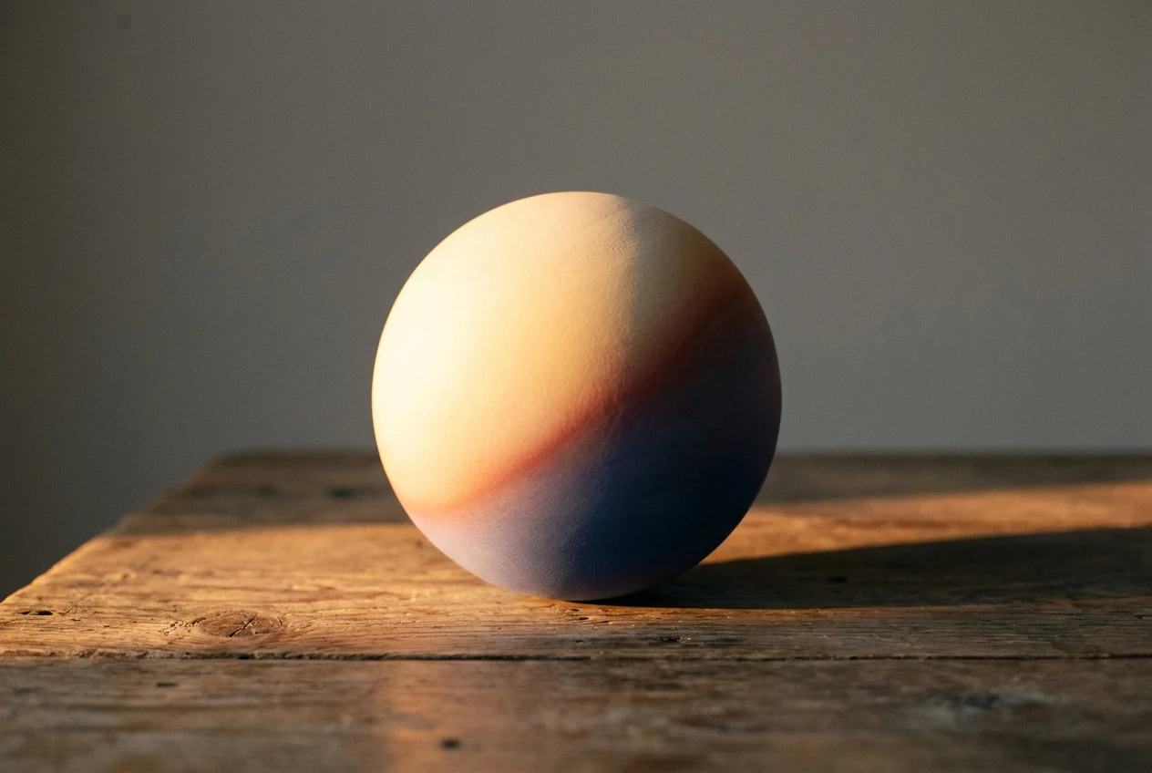
- Shift the lit side toward the light’s hue. For warm sun, that means a little more orange or yellow than the local color.
- Shift the shadow side toward the fill’s hue. For a blue sky, that means a little more blue or violet.
- Keep the midtone in between, close to the local color.
Keep the shifts moderate. If the whole figure turns orange on one side and blue on the other, it looks like a colored gel was laid over a photograph. Start subtle and push until the form reads, then stop.
One more pattern to know: on skin and other translucent surfaces, the edge where light turns into shadow often looks warmer and more saturated than either side. Painters often add a slightly redder band there. Try it and see whether it improves the form in your own painting.
Shadows Are Not Darker Versions of the Local Color
The most common way to make a shadow is to take the local color and lower its brightness. In HSB terms that keeps the hue and saturation the same and reduces only B. The result is usually a dull, heavy patch, because real shadows are lit by something, and that something has a color.
A better approach is to ask what is lighting the shadow, then shift the hue toward it. A few examples under warm sunlight with blue sky fill:
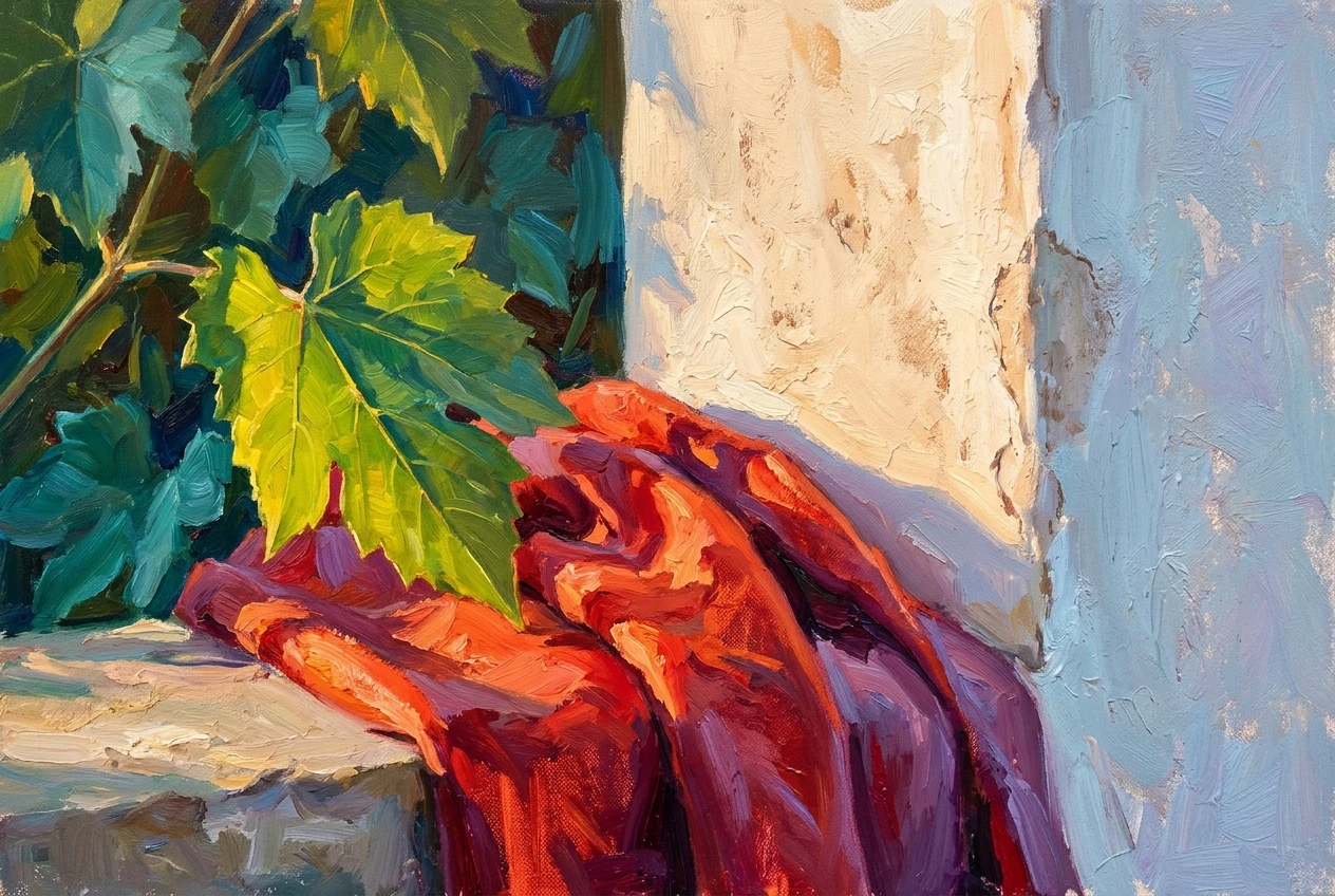
- A green leaf is yellow-green in the light and a bluer, more teal green in shadow.
- A red shirt goes toward crimson or a purple-leaning red in shadow, rather than brown.
- A white wall is warm cream in the light and a pale blue-gray in shadow.
- A cast shadow on the ground takes the ground’s color, pushed toward the sky color.
Saturation in shadows can go either way. In bright outdoor light, shadows often have lower contrast with the lit areas, so shadow colors can stay quite rich. In dim interiors they tend to gray out. Decide based on your light sentence, not a fixed rule.
You can build shadows on a separate layer instead of repainting each object. Put a Multiply layer above the flat colors, clip it to the layers below if your software supports clipping, and paint the shadow shapes with a saturated blue-violet. Multiply darkens and tints at once, so you get the hue shift for free. If the effect is too heavy, lower the layer opacity instead of switching to a gray, which would bring back the dull shadow you are trying to avoid.
Keep the shadow shapes simple and connected. A cluster of shadow shapes of similar value reads as one coherent shadow side, while scattered small shadows of varying darkness read as noise.
Bounce Light and Ambient Color: Where Realism Hides
Once the key light and the main shadow are in place, the next layer of believability comes from light that reflects around the scene. There are two kinds.
Bounce light is light that hits a surface and reflects onto a nearby one, carrying that surface’s color. A figure standing on warm orange sand gets a warm glow on the underside of the jaw, the lower arm, and the bottom edges of the clothing. A person leaning on a green wall picks up a faint green on the near side of the face. Bounce light appears inside the shadow side, close to the surface it bounces from.
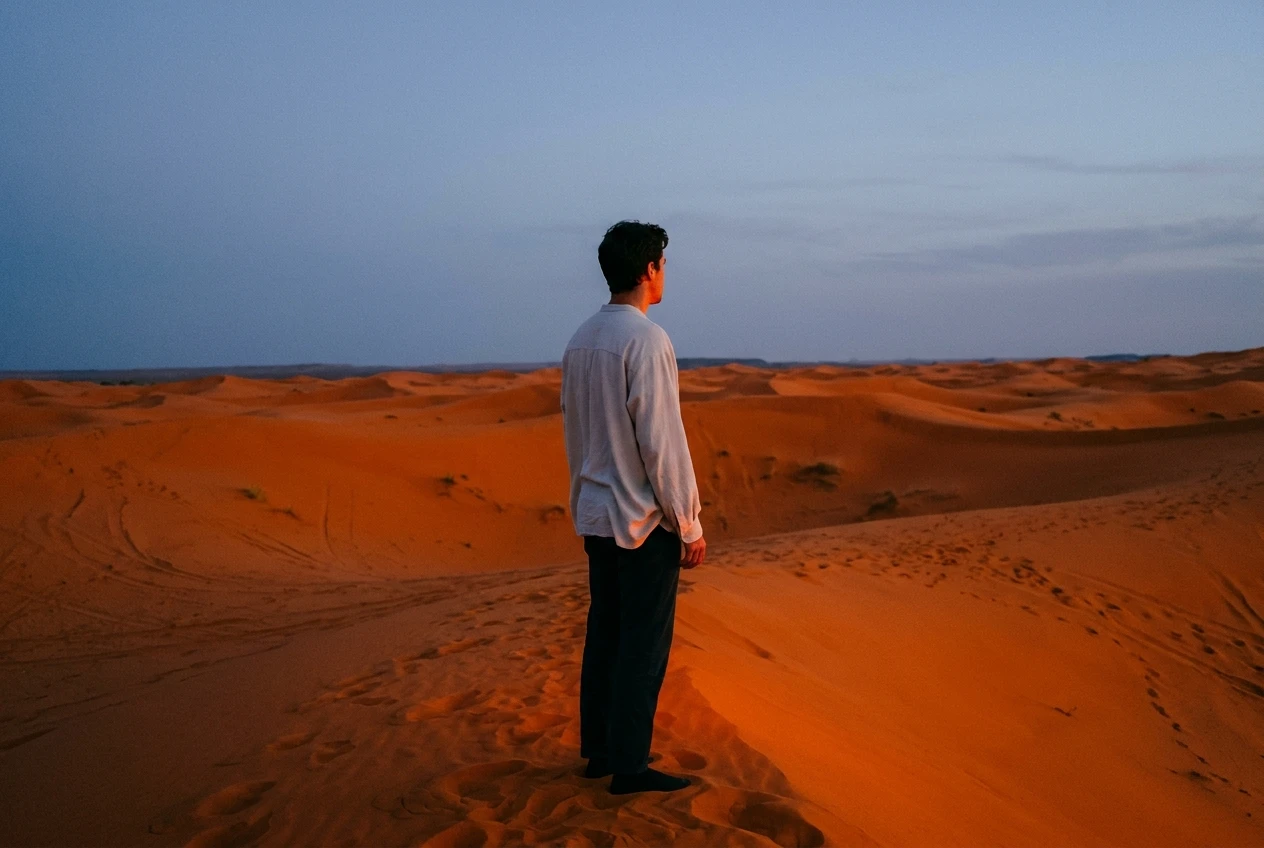
Ambient color is the general tint of the environment: the blue of an open sky, the warm cast of a room with yellow walls. It affects the overall color of shadows and of distant objects.
A few practical rules for bounce light:
- Keep it lower in value than the key light. If the bounce is as bright as the lit side, the form loses its shape.
- Place it near the edge of the shadow, close to the surface it comes from, instead of filling the center of the shadow.
- Keep it low in saturation unless the reflecting surface is strongly colored and very bright.
- Skip it where nothing could plausibly be reflecting. A bounce with no source reads as a mistake.
Ambient color also explains why distant objects look cooler, lighter, and lower in contrast: air between you and the object adds its own color. If you paint landscapes, this is a color-based way to build distance, and the article on creating depth and perspective in digital landscapes shows how it works with composition and scale.
Using Color Contrast to Point the Viewer at the Story
Viewers look first at the area of highest contrast. Contrast has three forms here: value (light against dark), temperature (warm against cool), and saturation (vivid against gray). Your story beat from earlier tells you where to concentrate them.
Choose one focal area and give it the strongest version of at least two of the three. A small warm lamp window in a large cool blue night scene does this: it is the lightest, the warmest, and the most saturated spot all at once. Everywhere else, hold back. Lower the saturation of secondary objects, soften their value contrast, and keep their temperature closer to the surrounding average.
Area matters as much as intensity. A common approach is to let one temperature dominate most of the canvas and keep the opposite temperature for a small accent. Equal amounts of warm and cool compete with each other, and the eye has nowhere to land.
Temperature can also carry feeling, though its meaning depends on context. Warm light can suggest arrival, safety, or heat, but in another painting it can suggest fire or danger. Cool light can read as calm or as isolation. Your story sentence settles which one you mean. If the traveler reaching the house is a relief, the warm door is welcoming. If the same door is threatening, you might make the light on it a sickly, narrow, cooler yellow, with surrounding shadows that are not especially cool.
Fixing a Muddy Painting with Color Adjustment Layers and Overlays
If you already have a painting that looks gray, flat, or inconsistent, you do not need to repaint it. Adjustment layers and blend modes can restructure color while the original paint stays untouched underneath. Names vary between Procreate, Krita, Photoshop, and others, but the tools are similar.
First, check the value structure. Add a temporary layer filled with neutral gray set to the Color blend mode, which shows your painting in black and white. If the grayscale version has no clear light and dark grouping, adjust values first. Color shifts cannot rescue a painting whose values are scattered.
Then try these fixes, each on its own layer so it can be reduced or removed:
- Color Balance: push shadows toward blue or cyan and highlights toward orange or yellow, in small amounts. This is the quickest way to impose a warm-light, cool-shadow structure.
- Overlay or Soft Light layer: paint a warm gradient or soft shape from the light’s direction. Keep opacity low and see how much it changes.
- Multiply layer: paint the shadow shapes in a saturated blue-violet or other fill color, as described earlier.
- Color or Hue layer: paint over an area that has drifted away from the palette, and the color shifts without changing the underlying values.
- Saturation mask: increase saturation only inside the focal area and lower it slightly outside.
Adjustment layers apply their effect to everything below them, so they are best used with masks. Mask the effect to the areas it belongs in, such as warm light only on surfaces facing the light. Also treat the result as a guide, not a finish. After seeing what works, paint the best of it directly into key areas so the edges and brushwork stay consistent.
A Repeatable Color Pass for Your Workflow
This is the full sequence, assembled so you can run it on any painting after the drawing and values are settled.
- Write two sentences. One describes the light: direction, color, hardness, and fill. The other states the story beat.
- Block in flat local colors. Use five to seven shapes with no shading, then save this version as your “before.”
- Check values in grayscale. Fix the light and dark grouping now, before adding any color effects.
- Add the shadow layer. Use Multiply with the fill color, painted as a few connected shapes on the side away from the light.
- Add the light layer. Use Overlay or Soft Light with the key light’s color, masked to surfaces that face it.
- Add bounce light. Place small, low-value patches of nearby surface colors at the edges of shadows.
- Place the focal accent. Give the story beat the strongest combination of value, temperature, and saturation contrast, and quiet the rest.
- Unify. Add one subtle Color Balance or gradient layer over everything so all the colors share the same ambient tint.
- Check. Flip the canvas horizontally, squint, and look at the grayscale version once more. Ask whether the eye goes where the story beat says it should.
This pass belongs after sketching and value work and before final detail rendering. For where it sits in the larger sequence from sketch to finish, see the professional digital painting workflow.
Take one unfinished painting from your portfolio and run this color pass on it, then compare the before and after side by side.